In order to help NetEase Cloud Music (NCM) enhance user experience and ultimately improve its user engagement, we aim to differentiate inactive users from active users and build a personalized recommender system. In this report we provide a summary of our findings from analysis of the NCM business case and the accompanying data set. The code used to perform the analysis and develop recommender systems can be found in my Github.
This report is structured around 4 main sections:
1. Introduction and Business Goals
- About NCM
- The Data
- Our Goals
2. User Characteristics and Engagement
A detailed analysis of the NCM dataset to produce insight and understanding regarding user characteristics and preferences.
- Usage Scenarios
- User Activity Intensity
- User Demographics: location, gender and age
- User Behavior and Preferences: tenure, impression and content
3. User Activity Prediction Model
Models to predict user activity based on users’ early actions.
- Logistic Regression
- SVM
- Random Forest
- Neural Networks
4. Recommender System
- A review of recommender system best practice
- Recommender systems for NCM and their relative merits
5. Business Implications
- Recommendations to NCM
This post contains Section 1 and 2. Please check here for section 3, and here for Section 4 and 5.
1. Introduction and Business Goals
About NCM
NetEase Cloud Music (NCM) is one of the largest Chinese companies in the growing music/video streaming market. NCM has become very popular as a free music streaming service since 2013, with its major product being a mobile app with five main tabs:
- Discovery (recommended albums and playlists)
- Podcast (a single feed of podcast)
- My Own Music (locally stored and liked own music and playlist)
- Following (posts from the accounts you’re following)
- Cloud Village (feeds of short music content cards recommended to a user)
The focus of this business report and the data challenge is on the Cloud Village platform, where users can post short videos or sets of images with a specific music. Cloud village tab can be divided into two subtabs (on the top):
- Music Square - shows two vertical streams of music video cards recommended to a user by the NCM recommender system. Categories includes Music Collection, Hot Music, Musician, Live Music, Original Music, Music video, Dance,…
- Karaoke Room - shows two vertical streams of individual rooms for social acitivities such as chat, sing, games and even study. Users can join the existing rooms or create their own rooms.
The Data
We are provided with four categories of data (impressions, cards, creators and users) from NCM Cloud Village fully described in Zhang et al.(2020). In particular, the data includes information for over 57 million Impressions associated with over 2 million users from November 1st to November 30th 2019. The impressions in the data refers to the display of a card to a user. Users in the data do not contain the entire population of users, but it is a randomly sampled subset of users from those who have accessed the tab at least once in the sample period. According to Zhang et al.(2020),the data is spread across 6 tables that can be joined and combined to offer a full representation of the events:
- Impression_data.csv - Impression level data (57.7 mil. rows) with 13 data fields including user actions
- Mlog_deomgraphics.csv - Card level data (253k rows) with static information on the cards
- Mlog_stats.csv - Card-day-level data (4.2 mil rows) with daily summary statistics for the card-user actions
- Creator_demographics.csv - Creator level data (90.5k rows) with static information on content creators
- Creator_stats.csv - Creator-day-level data (2.6 mil. rows) with daily summary statistics for creators
- User_demographics.csv - User data (2 mil. rows) with static information on the users
Our Goals
Considering the data availability, we focus on the analysis of the Music Square in Cloud Village. The main goal of the report could be framed as understanding the NCM Cloud Village user base in terms of user activity and deriving insights and models that could help NCM differentiate users and develop customized recommender system, and ultimately improve the user activity and engagement. While there is no information on NCM current recommender system, using the datasets provided on cards impression and users demographic, user classification models and recommender systems could be designed using machine learning techniques, with either supervised learning or unsupervised learning model. The scope of this analysis is limited to developing an effective solution from the user perspective and we will not study on the creators’ behaviour at this stage.
2. User Characteristics and Engagement
The purpose of this analysis is to better understand the behavior of NCM users, espeacially behaviour of active users relative to inactive users. The insights from this analysis can be consumed by various departments to improve the overall customer experience and engagement.
There are plenty of null values in the user demographics dataset, as it is normal that users don’t want to give out their personal information during registering. Even though their demographic information is not complete, their behavior data are still worth investigating. Therefore, we include users with null value in the activity intensity analysis, while they are excluded from user demographics analysis.
The code for section 2.1 to 2.4 is available here: Appendix I.
2.1 Usage Scenarios
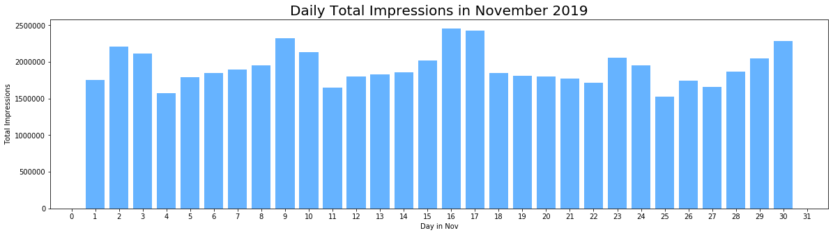
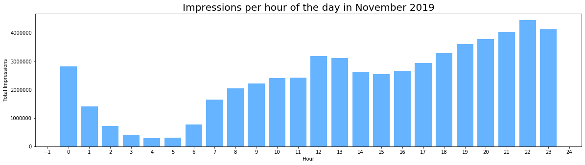
As we can see from the first graph below, which shows the number of impressions per day across the month, we observe a cyclical pattern with an increased level of activity at the weekends. Closer inspection of the data also reveals a daily cyclical patten, shown in the second figure below, where an increase in the impressions during lunch time and in the evening after work can be observed. From this we can infer the predominant use case for the application is to unwind and decompress outside of working hours.
2.2 User Activity Intensity
In the dataset, NCM provides us with a column ‘level’ which shows the activity intensity of the user ranging from 0 to 10. The activity intensity level is a combination of a user’s app time and frequency of interactions with app; the smaller this number is, the less active the user is. (Zhang et al.(2020)). We will first take a look at the ‘level’ column.
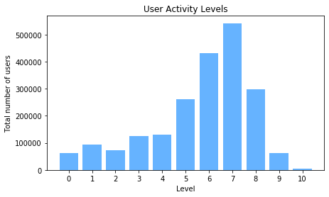
The above figure shows the distribution of the activity intensity level among the user base. The majority of users are with level 6 and 7 and more than 64% of users are with level over 6. We then take a closer look at the user behavior in each level.
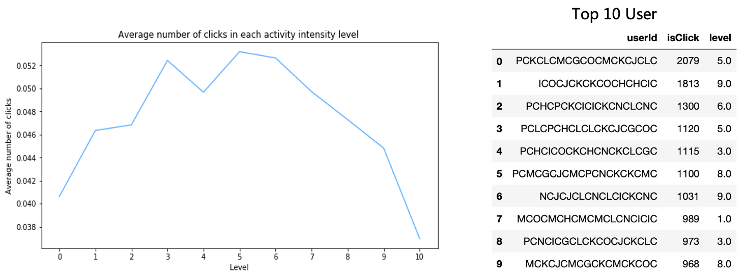
We can clearly see that a higher activity intensity level doesn’t guarantee an actual active behavior, as the average number of clicks is decreasing from level 5 to 10 and reaching the lowest value at level 10. And when we look at the Top 10 most active users, their activity intensity level ranges from 1 to 9. Therefore, we don’t think the activity intensity level in the dataset is a good indicator for classifying active and inactive users, instead, we assign an new activity level marker to each user based on their clicks in November 2019. We use the percentage of cards a user clicked on from the total number of impressions they were exposed to during the month, also known as the click-through rate (CTR), as a proxy of the click probability on recommended cards. And we define that users with less than average click probability (around 2.338%) are classified as ‘inactive’.
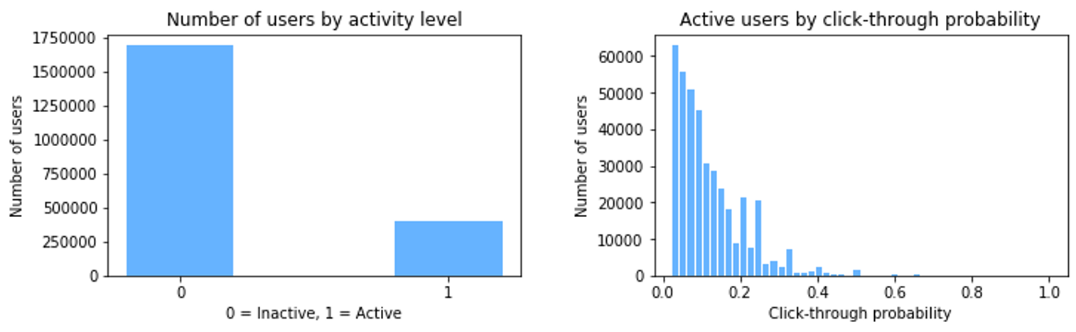
The classes are imbalanced, with only nearly 20% of users satisfying the 2.338% threshold, as defined above. And closer observation of the click through rates shows a near exponential decay with only about 18% of users having a click probability of over 20%.
Having developed an understanding of active and inactive users, we then try to better understand the impact of some user features on their level of engagement.
2.3 User Demographics
We have some user demographic information, including province, age and gender. In addition, user tenure(measured by the registered months) and the number of people a user has followed till December 1st are also provided. We then delve into the analysis of how active users differ from the inactive ones in terms of these user features.
-
Location
We combine our NCM data with the provincial GDP of China in 2019(from Statista) to find out more about the geographic influence.
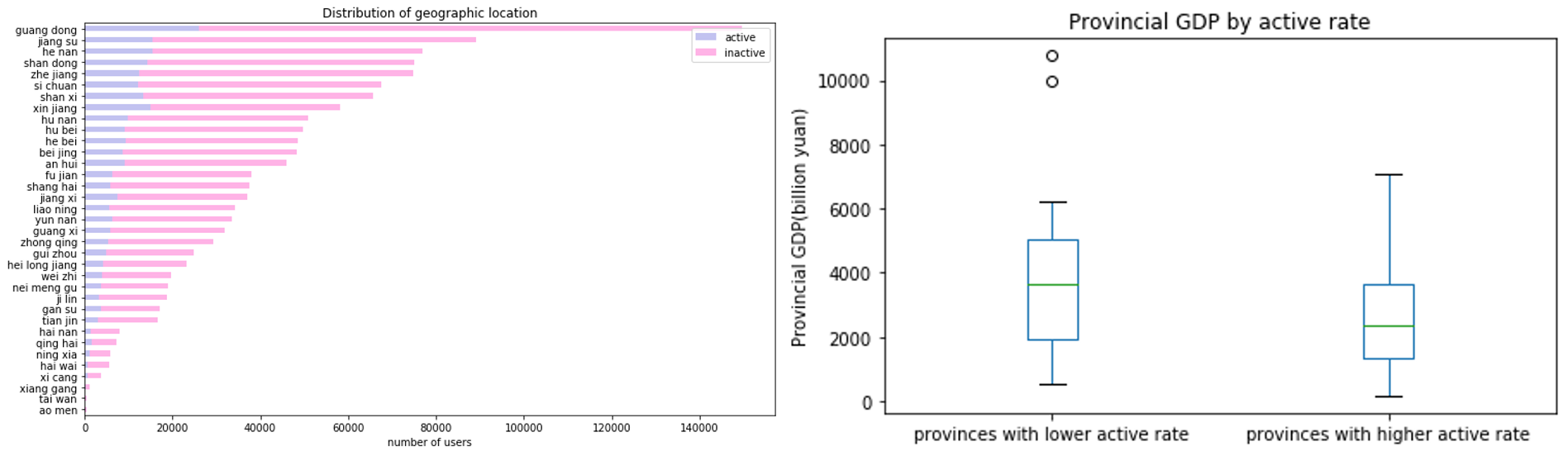
The average active rate among provinces is about 18% and nearly half of the provinces are with an active rate above the average level. Provinces like Beijing, Shanghai, Guangdong are with lower active rate and provinces with higher active rate includes Xinjiang, Tibet, Qinghai, etc. The above box plot shows that provinces with lower active rate have generally higher level of GDP. The average GDP in provinces with lower and higher active rate are 4245.6525 and 2549.045 respectively.
Above all, we find that users from more developped regions are less likely to be active in general. The intuitive interpretation to this is that, users from more developped regions(provinces with higher GDP level) are more often live a hectic life so that they have less time for leisure. Moreover, these users face more diversified ways for entertainment, therefore it is harder to attract them and keep them addicted to the application. On the contrary, users from less developped regions may have more time and lower quality requirements.
-
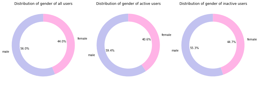
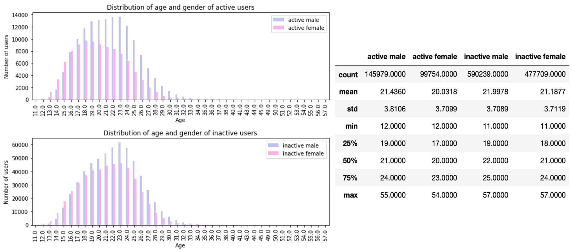
Gender and Age
As we can find in the following figures, male users represents a larger proportion in active users than female users and the percentage of female users in inactive users is higher than that in active users. Hence, we can loosely infer that the application may be more appealing to the male users than to the female users.
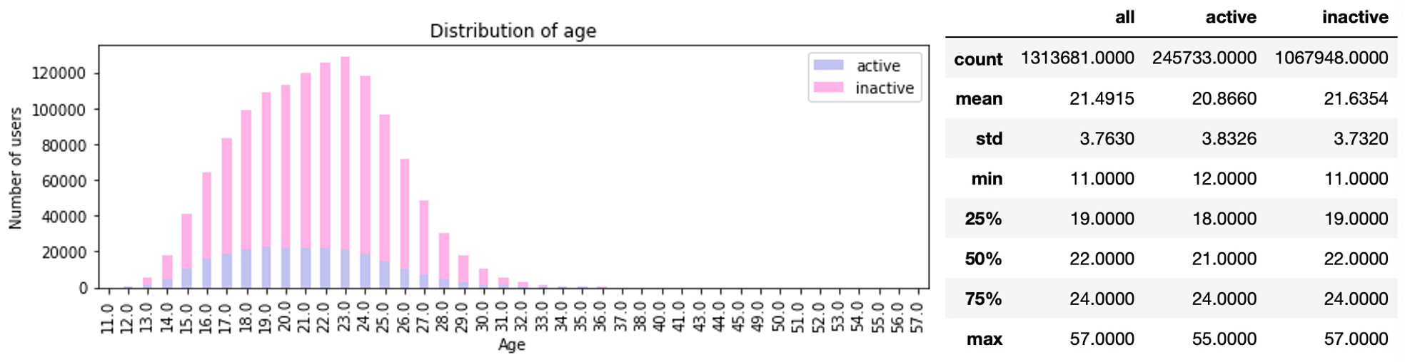
The youngest user is 11 years old, the mean and median are 21 and 22 years old respectively, and the oldest active user is 57 years old. 85% of the users were aged 25 and below. For active users, the youngest user is 12 years old, the mean and median are both 21 years old respectively, and the oldest active user is 55 years old. Therefore, the user population, especially the active user population, for the application is relatively young.
Among the youngest active and inactive users (12-16 years), girls are a majority, though that changes with the age of 17 onwards, where users are predominantly male. Among female users, younger users are more likely to become active, since average age of active female users is smaller than that of inactive female users. No big age difference between active and inactive male cohorts.
2.4 User Behavior and Preferences
-
Tenure
Having developed an understanding the demographic features of active and inactive users, we then seek to better understand the impact of tenure, defined as the length of their contract, on their level of engagement.
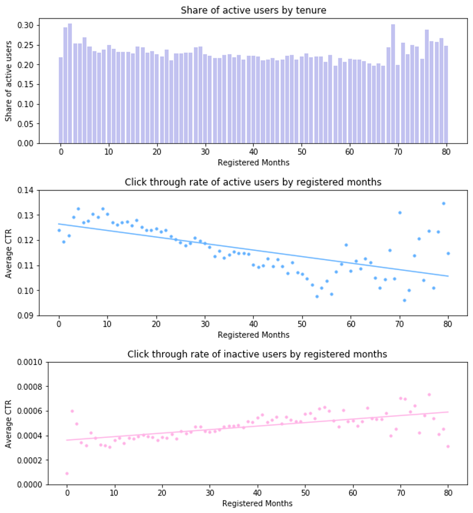
We observe that, on average, the CTR of longtime users(more than 6 months since users’ first registration) is about 21% lower than that of the new users(less than 6 months since users’ first registration). And a more detailed analysis shows that the average CTR for active users first peak at small registered months(smaller than 10 months), then decreases with the increase of registered months, and finally revert to a high level at large registered months(more than 60 months). Oppositely, for inactive users, the average CTR faces a upward trend along with the increase of registered months. There are many potential motivations driving these changes in behavior. One possible reason can be that people experiment with the platform and then lose their interest due to the poor user experience. If NCM could improve the ability of its algorithms to generate and display fresh content or exploration enabaling users to discover alternative materials, users were more likely to become long-term users as those highly engaged users with over 60 months of tenure and contribute more active behaviors. Moreover, we can find that new users are either very active users or very inactive users, which brings NCM a big challenge of how to attract and retain new users quickly.
-
Impression and Content
In addition to the analysis of user tenure, we look at users’ activity patterns in comparison with the less engaged users based on impression dataset. We also review the behavior of the new users (tenure <= 6 months), as NCM may be particularly interested in being able to catch any early signs of high engagement.
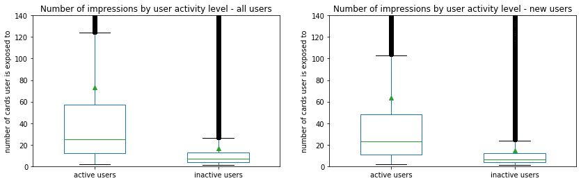
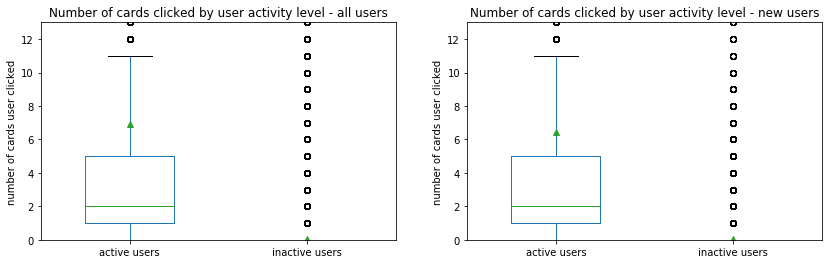
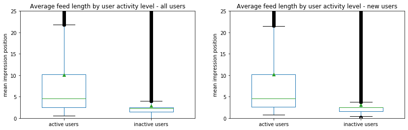
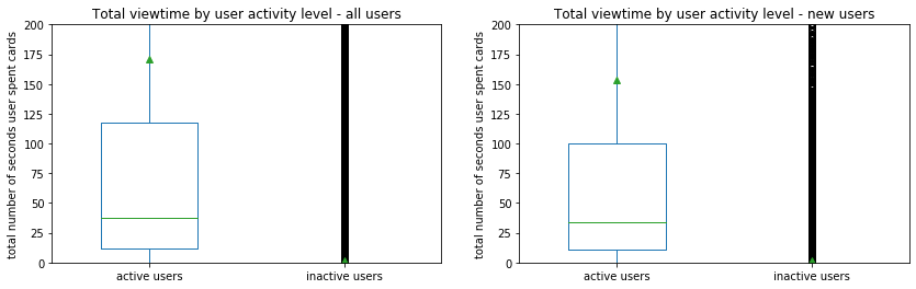
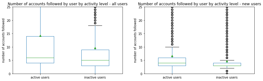
The active users are exposed to a significantly higher volume of recommendations, and their number of clicks, average feed length, seconds of viewtime and number of accounts followed are also much larger than those of the inactive users. That indicates that users of active class tend to scroll far down their feed and follow creators to forwardly get more contents, but the inactive users seem to return to the application less often without actively engaging with the content.
If we look at the number of clicks and the length of feed of all users and new users at the same time, we can find that the average number of clicks for new users (1.34) is smaller than that of all users (1.37), while the average length of feed of new users (4.57) is greater than that of all users (4.26). The intuitive interpretation to this is that new users with less personal information available is less likely to get accurate recomendations on top of their feed and thus scroll down in search of interesting content or leave the tab without clicking, while others who get the right recommendations on top of their feed click on the videos more often.
We are also interested in the preference of users among cards of various content. By aggregating the impressions and clicks recorded in November 2019 by user and content ID we can gauge the level of diversity of recommendations and preferences on the platform.
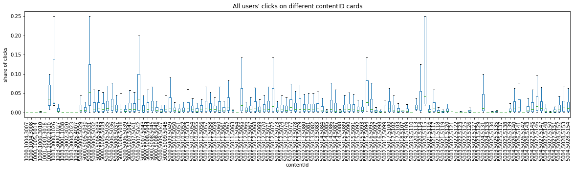
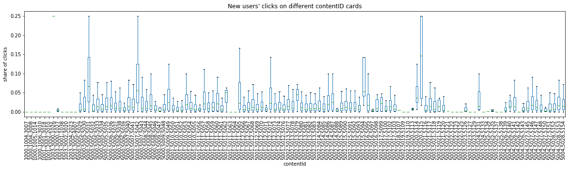
The plots above highlight the popularity patterns. The boxplots show the share of clicks, that cards of a particular content ID received during the month across all users, calculating by the percentage of clicks to total impressions a user is exposed to. The share of clicks for the majority of content types is below 5%, whereas around 4 visible bars enjoyed a share of clicks that reached over 10%. The content that appeals to new users is different from that of all users. For example, contentId ‘5002,5015,5094’ is more popular among new users, while no clicks from new users for contentId ‘1001,2002,2010’ and ‘1003,3000,1026’ which enjoy popularity among all users.
In conclusion, our key findings from the data exploration are:
- Location matters: users from less developped regions are more likely to be active.
- Gender matters: the application may be more appealing to the male users.
- Age matters: The user population, especially the active user population, for the application is young.
- User tenure matters: new users with less than 6 months of tenure and longtime users with over 60 months of tenure tend to be more active.
- Recommendation matters: volume of recommendations and average feed length are larger for active users and new users are less likely to get right recommendations.
Based on these findings, we next try some machine learning models to predict users’ activity intensity level with user demographic information and early behavoirs. Please check it here.
References
- Zhang, D., Hu, M., Liu, X., Wu, Y., & Li, Y. (2020). NetEase Cloud Music Data. Manufacturing & Service Operations Management.